How to Read Retention When Workers Can't Leave
The quits rate looks stable. Workers who can't leave and workers who don't want to look identical on the dashboard.
The number worth a second look
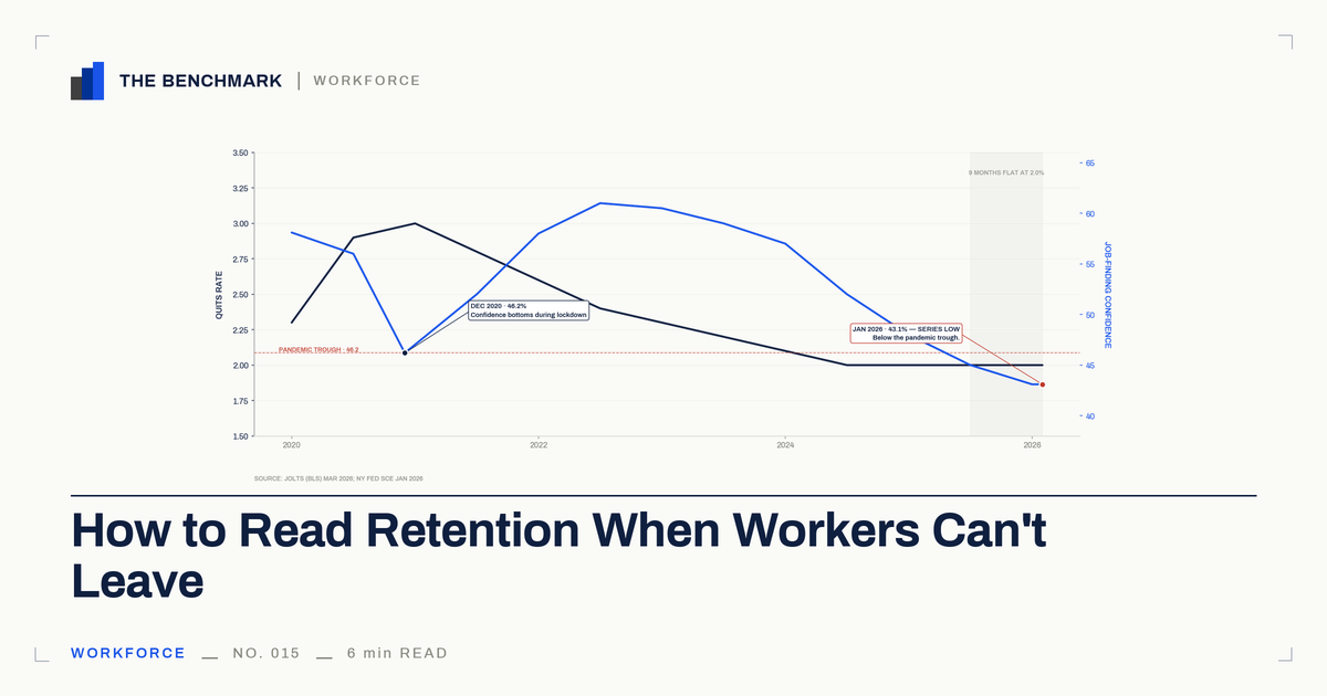
The March 2026 JOLTS release put the national quits rate at 2.0%. That number has held at or below 2.0% for nine consecutive months. On most retention dashboards, that reads as good news. Low quits, stable headcount, a workforce that is staying.
The reading isn't wrong. The instrument is incomplete.
Indeed Hiring Lab's labor economist Cory Stahle put it plainly in his January 2026 JOLTS analysis: workers don't quit jobs they can't afford to leave. The quits rate, he wrote, is a critical barometer of worker confidence — and that confidence has been stubbornly, conspicuously low for the better part of a year.
So the question isn't whether the team is staying. The number already answered that. The question is what the quits rate, on its own, can and cannot tell you about why.
Chosen-stay and stuck-stay read the same
A worker who stays because the job is good and a worker who stays because she can't afford to leave look identical to the quits rate. Both are non-departures. Both pull the metric down.
The first one is loyalty. The second one is a trap. The metric can't tell them apart.
This is a property of the instrument, not a property of any one company. The quits rate was designed to read voluntary departures as the leading indicator of workforce health. When the labor market freezes, voluntary departures fall across the economy — and a flat reading, on any dashboard, looks identical to a contented team. The dissatisfaction is still there. The signal that would have surfaced it is not.
That is the gap worth naming. Right now, the stuck-stay share of your retained workforce is larger than it has been in a decade, and the quits rate is the last place it will show up.
What the quits rate cannot show, by construction
Here is what is happening underneath the 2.0% — in the same data series the Fed publishes for everyone.
The New York Fed's Survey of Consumer Expectations — the Federal Reserve's authoritative quarterly read on worker confidence — found in its January 2026 release that the perceived probability of finding a job within four months had fallen to 43.1%. That is a series low. It is below the pandemic trough of 46.2% in December 2020. Workers right now report less confidence in their ability to land a new job than they did during the COVID lockdowns.
The expected likelihood of moving to a new employer fell to 9.7% — the lowest since March 2021.
Then the March 2026 release made the picture worse. Wage satisfaction dropped to 52.3%, the lowest share in the survey's twelve-year history. In the same release, the reservation wage — the minimum pay a worker says they would need to accept a new job — hit a survey high.
Read those two numbers together. Workers across the economy are simultaneously more dissatisfied with what they earn and demanding more to take the risk of leaving. That combination does not describe a contented workforce. It describes a trapped one.
The Atlanta Fed's Wage Growth Tracker confirms the trap is also financial. Since February 2025, job stayers have earned equal or higher wage growth than job switchers. In mid-2025, stayers were at 4.1% annual wage growth; switchers at 4.0%. That reversal has only happened twice in the last quarter-century — around the Great Recession and the dot-com bust. The wage premium that has driven voluntary quits for most of the post-2000 economy is gone.
The exit door narrows further when you look at where workers in at-risk roles could actually go. Xi Song and colleagues, in a Science Advances paper published in March 2026, found that workers in declining occupations have less than 36% the odds of moving to a growing occupation compared with cycling from one declining occupation to another. Only 5% of occupational moves go from declining to growing sectors. Nearly sixty percent of workers who do leave a declining occupation experience downward mobility.
Stack the picture. Workers feel they can't find another job. The wage premium for leaving has collapsed. For the workers in the roles most exposed to restructuring, there is statistically nowhere better to go.
None of that turns up in a quits rate. By design.
This 2.0% is not the 2015 2.0%
A reasonable counter sits ready here. 2.0% is the historical average. The JOLTS quits rate has run about 2.01% from 2000 through 2026. The pandemic surge was the anomaly, not the current number. What looks like a signal problem is just normalization.
This is the load-bearing move. Take it seriously.
The normalization read is fine on the surface. Indeed Hiring Lab itself offered a version of it in April 2026, framing the current state as a healthy low-hire, low-fire equilibrium — the rational result of a labor market rebalancing after pandemic distortions.
But normalization cannot explain the New York Fed data. If the quits rate were returning to a healthy 2015 baseline, wage satisfaction would not be at a twelve-year low. Job-finding confidence would not be below the pandemic trough. Reservation wages would not be at a series high.
The 2015 2.0% sat on top of workers who felt they had options and were exercising restraint. The 2026 2.0% sits on top of workers who feel they have no options and are exercising no choice at all. The headline number is the same. The underlying condition is unrecognizable.
Same dashboard reading. Different economy.
Where this argument gets complicated
The honest counter is about what happens next, not what is happening now.
The San Francisco Fed's 2022 analysis of the Great Resignation argued that burst quitting requires demand-pull — employers actively posting and poaching — not just an end to the conditions suppressing exit. Under that reading, the suppressed dissatisfaction may release slowly rather than all at once, depending on how a recovery actually arrives.
That is a fair narrowing. This piece does not need to predict when the stuck-stay population starts moving. It only needs to name that the quits rate, on its own, cannot tell anyone it has.
One more wrinkle worth naming. The May 2026 AEA Papers and Proceedings reported that workers in high-AI-exposure declining occupations are 5.2 times more likely to transition into another declining occupation than a growing one. Nearly seventy percent experience downward or lateral mobility. The workers whose roles are most exposed to AI restructuring are the same workers least able to land safely elsewhere. When the thaw arrives — slow or fast — that population is where the gap in the metric matters most.
The conversation worth having now
The retention dashboard isn't broken. It is doing exactly what it was built to do: count voluntary departures. The gap is that voluntary departures, in this labor market, are no longer a complete picture of workforce health.
The constructive move is to pair the quits rate with signals that read dissatisfaction directly. Pulse-survey trend lines. Manager one-on-one notes. The qualitative read your skip-levels are already generating. Internal mobility patterns. None of these replace the quits rate. They give it the context it cannot supply on its own.
The conversation upstairs writes itself from there. When the EVP says the team is stable because nobody is leaving, the operator who has read the Fed data has the better sentence ready. Low quits right now are an industry-wide signal gap, not a loyalty signal. The whole market is reading an absence. Here is what we should look at alongside it.
That sentence travels. It does not indict the dashboard, the team, or the people who built either. It names a structural limit on the instrument and proposes the upgrade.
Bottom Line
The quits rate was built to read worker confidence through the exit door. When the exit door closes for reasons that have nothing to do with how a company is run, every dashboard pointed at it reads quiet — and a worker who can't afford to leave looks identical to a worker who doesn't want to.
Same dashboard reading. Different economy. That is the sentence to walk into the room with, and the work to pair the metric with signals that can tell chosen-stay from stuck-stay is the upgrade the conversation needs before conditions change.
Sources
- Indeed Hiring Lab. January 2026 JOLTS Report: Waiting to Exhale. Cory Stahle, March 13, 2026.
- Federal Reserve Bank of New York. Labor Market Expectations Deteriorate as Job Finding Expectations Reach Series Low. January 8, 2026. Survey of Consumer Expectations Labor Market Survey.
- Federal Reserve Bank of New York. Labor Market Expectations Soften Slightly, but Delinquency Expectations Improve. March 9, 2026. Survey of Consumer Expectations Labor Market Survey.
- Federal Reserve Bank of Atlanta. Wage Growth Tracker — Job Switcher vs. Job Stayer. Ongoing series; reversal identified February–August 2025.
- Science Advances. Trapped in declining occupations: Barriers to worker mobility in a changing economy. Xi Song et al., March 2026. Peer-reviewed study.
- Indeed Hiring Lab. What Goes Up, Must Come Down: How the Labor Market Is Emerging From the Long Shadow of the Pandemic. April 13, 2026.
- Federal Reserve Bank of San Francisco. Great Resignations Are Common During Fast Recoveries. April 2022. Economic Letter.
- American Economic Association. AI-Accelerated Occupational Decline and the Mobility Trap. Papers and Proceedings, May 2026, vol. 116, pp. 246–250. doi:10.1257/pandp.20261004.